

Introduction
Do you want people to remember your brand? Well, you better buckle up and pay attention to your logo design. A logo plays a key role in branding, acting as the visual representation of your brand identity. Don’t believe me? Let’s see at some successful logos that have become part of our everyday lives. Think about it – you see those golden arches and immediately crave a burger, or that little blue bird and you’re ready to tweet your heart out. So, let’s dive into the design principles and best practices of creating a memorable logo.

Understanding Logo Design
It’s crucial to know the various kinds of logos. There’s the wordmark which is basically your brand name in a cool font. Then there’s the lettermark which is a shortened version of your brand name in a cool font. The brandmark is the iconic element of your logo. And finally, the combination mark, which is a mix of the wordmark and brandmark. The next thing to consider is the elements of a logo – the font, color and iconography.

Best Practices for Logo Design
First and foremost, research and analyze your target audience – remember, your logo needs to resonate with them. Next, choose the right typography and color scheme – something that will make your brand stand out. And don’t forget to ensure scalability and versatility of the logo – you never know where your brand might end up. Lastly, keep it simple and memorable – people have short attention spans, don’t bore them with a complicated logo.

Designing a Memorable Logo
Here’s where things get fun. Identify the unique selling proposition (USP) of your brand and choose the right iconography to communicate it. Creating a balance between elegance and simplicity is key. Add an element of surprise or hidden meaning – you want your logo to be memorable, right?
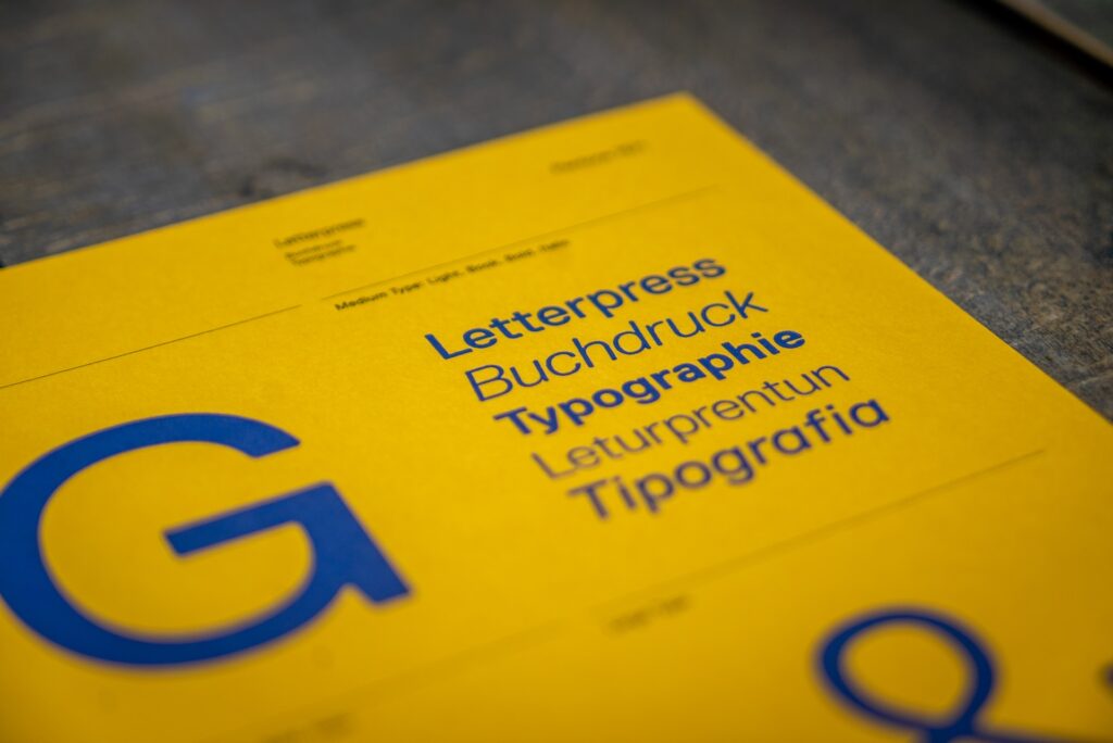
Tips for Typography
Now let’s talk about the font. Choosing an appropriate font that resonates with your brand is essential. And don’t forget about effective font pairing – just like wine and cheese, some fonts go better together than others. Pay attention to the kerning and letter spacing – you don’t want your logo looking like a jumbled mess. And don’t be afraid to use negative space to create visual interest.

Colors and Branding
Ah, color psychology – it’s a real thing. Different colors communicate different emotions and associations. Pay attention to color contrast and harmony, and choose the right colors for your target audience.

Iconography and Visual Elements
Visual elements are key in creating a memorable logo. Use shapes and symbols to communicate the ethos of your brand. Create a brandmark that represents the brand and don’t forget to use negative space to communicate a message – it’s like killing two birds with one stone.

Testing and Refining
Prior to launching your logo, it is crucial to conduct thorough testing and refinement. Market research and gathering feedback and insights is a must. Refine the design based on feedback and then get that baby ready for launch.

Launching the Logo
Choosing the right launch strategy is important, but equally important is installing the logo across all brand touchpoints. Future-proof the logo for brand evolution and measure the success of the new logo.

Common Logo Design Mistakes
Let’s face it, we’ve all made mistakes – but don’t let common logo design mistakes be one of them. Avoid using cliched design elements, copying other brand’s logos, overcomplicating the design, and choosing aesthetics over functionality.

FAQ
Still have questions? Here are some frequently asked ones:
What are the best practices for choosing a color scheme for my logo?
Should I use an icon or a wordmark in my logo?
How important is it to have a completely original logo?
What are the advantages of using negative space in logo design?
Conclusion
And there you have it, folks – the key takeaways from creating a memorable logo. Invest in a great logo for your brand. It will bring many benefits. Don’t just learn about design principles and best practices, apply them to create a memorable logo that lasts.