

I. Introduction to Color Theory
A. Basic definition and history of color theory
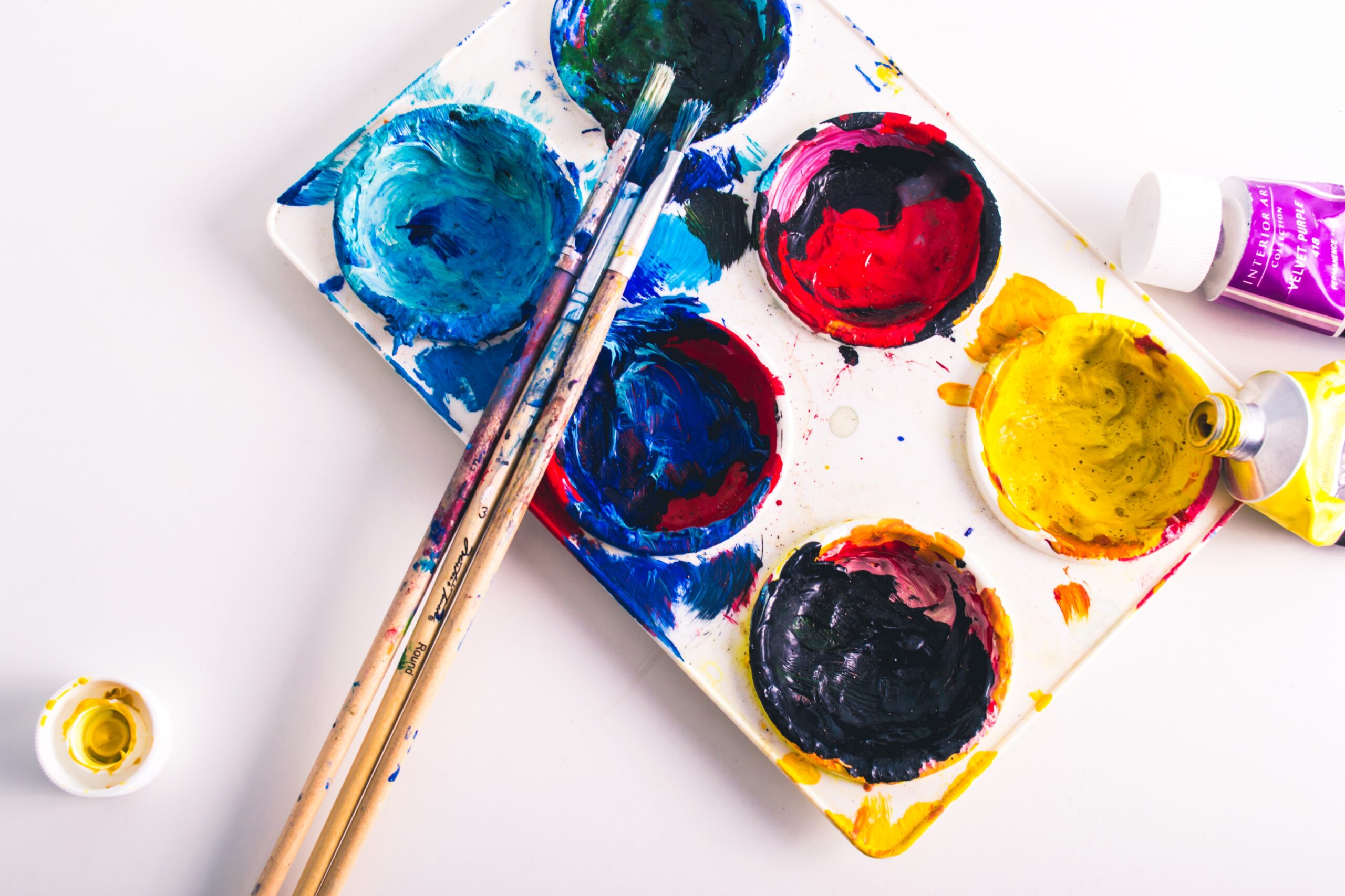
If you’ve ever slathered two different shades of icing on a piece of cake only to recoil at the unexpected muddy result, then you’ve dabbled in the world of color theory. Color theory is the collective knowledge and guidelines regarding the use of color in art and design. It’s been around since the days when cavemen first scribbled on walls (although those guys were more ‘smear mud and hope for the best’ painters).
Color theory stepped into the limelight when Sir Isaac Newton decided to wrap a rainbow around a circle and invented the very first color wheel (man, that dude loved circles). Since then, artists and designers have been using color theory as their secret weapon to create visually spectacular masterpieces.
B. Importance of understanding color theory
Picture this – you’re reading a riveting novel, totally engrossed in the plot. Suddenly, the author starts describing the villain’s lair as “fiery blue with a touch of cheerful yellow”. Now, wouldn’t that throw you off balance? That’s because color affects our mood and perception in powerful ways (more on that in a bit), so understanding color theory is super useful not just for designers and artists, but for everyone since we interact with color daily.
C. An overview of the article’s subject
Grab a comfortable seat, because in this article, we’ll take you on a vibrant journey through the world of color theory. We’ll visit the color wheel’s colorful neighborhood, learn about cool color schemes, and discover how color influences our mood, emotion, and perception. We’ll also offer practical application tips for several disciplines, and help you avoid common color pitfalls.
II. Understanding the Color Wheel
A. Explanation of the color wheel
Think of the color wheel as the ‘Google Maps’ of color. It shows how colors are related to each other. It’s a circular diagram where the colors whirl around like dancers in a ballroom, intertwining and creating new shades and tints.
B. Primary, Secondary, and Tertiary colors
Primary colors are kind of like the ‘big cheeses’ on the color wheel. They’re the original colors – red, blue, and yellow – from which all other colors are created. Secondary colors (green, orange, and purple) are born when two primary colors decide to have a little dance together. And the tertiary colors? They’re the happy medium between a primary color and a secondary color next to them on the color wheel.
C. The significance of juxtaposing colors in the color wheel
You see, the location of colors on the color wheel isn’t arbitrary. When colors are placed next to, or opposite each other, some really interesting magic happens. They can either soften each other, shout loudly for attention, or create some sort of visual harmony. The way colors influence each other is a key part of what makes art and design so darn subjective and fascinating!

III. Exploring Color Schemes
A. Definition and application of monochromatic colors
Monochromatic color schemes are basically the color equivalent of that one English lit professor who loves exploring one book for an entire semester. It starts with one color – let’s pick blue for giggles. Then, you play around with the shade (adding black), tint (adding white), and tone (adding grey) until you get a whole range of hues. This scheme is excellent when you’re going for a soothing, minimalist design.
B. Utilisation of analogous colors in design
Analogous colors are like three best buddies, sitting side by side on the color wheel, bearing a common color that binds them together. They naturally blend well and are typically found in nature, providing a rich, yet harmonious look to designs.
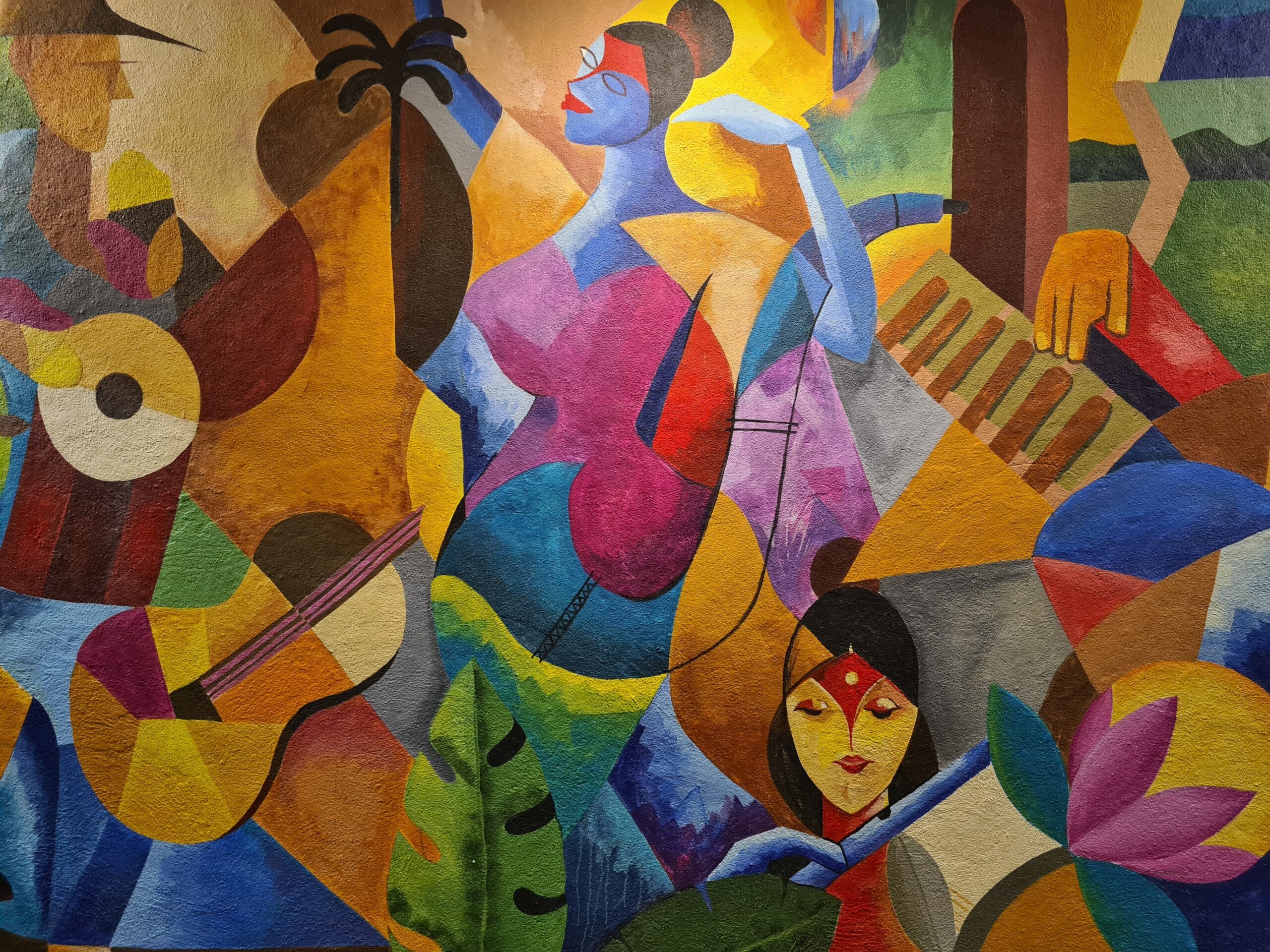
C. Working with complementary colors
Complementary colors are opposite each other on the color wheel, like Batman and Joker. They tend to bring out the best in each other (in terms of color, not crime-fighting capabilities). When used in a design, these colors create a sleek and vibrant effect, perfect for making elements stand out.
IV. The Role of Color in Emotion & Perception
A. Colors and their corresponding emotions
Do you ever wonder why HULK turns green when he’s angry? There’s a method to that color madness! Colors are often associated with specific emotions – Red symbolizes passion, blue represents tranquility, yellow can signify happiness (or panic if you’re a student looking at a highlighter). Utilizing these color-emotion associations can help designers provoke specific reactions from an audience.
B. Influence of color on perception
Colors can also alter our perceptions about things around us. Ever noticed how restaurants use a lot of reds and yellows? That’s because these colors are known to stimulate appetite (cue the sudden craving for french fries). Designers and artists exploit this power of colors to help shape the way we see and respond to the world.
C. Applying color psychology in design and art
Art isn’t just about making something look pretty (‘pretty’ is relative after all). It’s also about stirring emotions and creating resonant experiences. By understanding color psychology, you can determine what colors will be most effective for your design objective. And when you can add that little extra ‘oomph’ to your work, why wouldn’t you?
V. Practical Application: Using Color Theory in Various Disciplines
A. Navigating color theory in graphic design
Design is like cooking – you don’t want to overload your dish with every spice in the rack. Choosing the right color palette can set the mood, create cohesion, and guide users naturally through a design.
B. Understanding color in interior design
Whether you want to create a tranquil bedroom or an energizing office, effective use of color can make or break your space. You’re not just painting walls; you’re creating an ambiance, baby! And color theory can help you determine what colors will achieve the desired psychological effects.
C. Applying color theory in fashion and makeup
Remember the existential crisis we all had when we couldn’t decide if ‘The Dress’ was blue and black or white and gold? That, my friends, is color theory in fashion. Understanding which colors go together can help you to create outfits that pop. And in makeup, knowing color theory can guide you to choose colors that enhance your natural beauty, not compete with it.

VI. Common Mistakes and How to Avoid Them
A. Overusing or misusing color
Just like any good thing, too much color can turn against you. Using too many colors can confuse your viewer and make designs feel chaotic and disjointed. Choose a simple color palette and stick with it.
B. Ignoring the importance of cultural context
Colors might have universal psychological effects, but their cultural interpretations can vary significantly. Green might remind one person of healthy living, while another recalls money. Fail to consider these cultural contexts, and your design message could get lost in translation.
C. Forgetting about contrast and saturation
Contrast and saturation work as leverages to boost the art of colors. Good contrast improves readability, while well-thought-out saturation can generate emphasis and depth. Ignoring these elements leads to visual fatigue and loss of audience interest.
VII. Summary and Conclusion
A. Recap of key points discussed
So, we’ve journeyed from the historical roots of color theory through to its modern-day practical applications. We’ve explored the color wheel, dived into color schemes, and the psychological implications of colors. We’ve also explored its use in design and how to avoid classic color faux pas.
B. Importance of continual learning and practice
Remember, no one becomes a color theory Kahuna overnight. It’s a continual process of learning and practicing — and even making a few color blunders along the way. But don’t worry, every mistake is a step towards becoming a color theory master!
C. Final thoughts on the role of color theory in design
In the end, it all boils down to this: color theory is more than just a design tool; it’s a way to communicate, inspire, and engage. Master color theory, and you have one of the most powerful design tools at your disposal.
VIII. Frequently Asked Questions
A. What is the best way to practice applying color theory?
> “The best way is to get your hands dirty and actually start creating. Theorizing about color theory won’t get you far. Start small and gradually work your way into more complex designs. Remember, practice is key!”
B. How does lighting affect color?
> “A lot! Lighting can significantly alter how we perceive color. It can highlight or wash out colors and can set and change moods. Always consider your light source when working with colors.”
C. Can color theory principles be broken?
> “Can Bob Ross turn a painting mistake into a bird? He sure can, and so can you break color theory principles. They’re guidelines, not laws. Once you understand them, you can bend them to your creative impulses.”